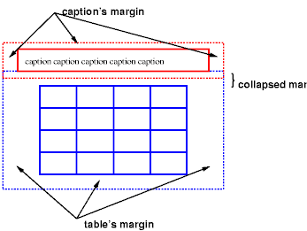
Diagram of a table with a caption above it; the bottom margin of the caption is collapsed with the top margin of the table.
17 Tablesw3 version
|
contents |
properties |
index
| | |||||||||||||||||||
|---|---|---|---|---|---|---|---|---|---|---|---|---|---|---|---|---|---|---|---|---|---|---|---|
<colgroup><col><col style=border-style:dotted;
                 border-width:10em; background-color:azure>
table‑layout property
text-align:

start | end | left | right | center | justify | match-parent | justify-all
vertical-align: top | middle | bottom
empty-cells property
speak-header property
Tables represent relationships between data. Authors specify these relationships in the document language and specify their presentation in CSS, in two ways: visually and aurally.
Authors may specify the visual formatting of a table as a rectangular grid of cells. Rows and columns of cells may be organized into row groups and column groups. Rows, columns, row groups, row columns, and cells may have borders drawn around them Data may be aligned vertically or horizontally within a cell and align data in all cells of a row or column.
Authors may also specify the aural rendering of a table; how headers and data will be spoken. In the document language, authors may label cells and groups of cells so that when rendered aurally, cell headers are spoken before cell data. In effect, this "serializes" the table: users browsing the table aurally hear a sequence of headers followed by data.
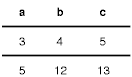
Here is a simple three-row, three-column table :
<TABLE border=1 bgcolor=linen style=border-style:dashed>
<CAPTION>This is a simple 3x3 table with a caption
<TR id=first> <TH>Header 1 1     <TH>head 1 2<Th>head 1 3
<TR id=first> <TH>Header 2 1     <TD>Cell 2 2<TD>Cell 2 3
<TR id=row2>  <TH>Header 3 1     <TD>Cell 3 3<TD>Cell 3 3
<TR id=row3>  <TH>-x-Header 4 1 x-<TD>C 5    <TD>x<br>C 6<br>x
</TABLE>
This code creates
|
|
The header text is centered horizontally and bold :
TH { text-align: center; font-weight: bold }
The next rules align the text header cells on their baseline
and vertically aligns the text in the center of each data cell:
TH { vertical-align: baseline }
TD { vertical-align: middle }
The next rules specify that the top row will be surrounded by a 5px
solid blue border and each of the other rows will have
various borders:
TR#first { border-bottom: 5px solid blue }
TR#row2 { border: 2px dotted red }
TR#row3 { border-bottom: 1px dashed black }
The borders around the rows overlap where the rows meet.
What color (black or blue) and thickness (1px or 3px) will
the border between row1 and row2 be?
See border conflict resolution.
The following rule puts the table caption above the table:
CAPTION { caption-side: top }
The following rule specifies that, when rendered aurally, each row of data is to be spoken as a "Header, Data, Data":
TH { speak-header: once }
For instance, the first row would be spoken "Header1 Cell1 Cell2". with the following rule:
TH { speak-header: always }
it would be spoken "Header1 Cell1 Header1 Cell2".
We discuss the various table elements in the following section. In this specification, the term table element refers to any element involved in the creation of a table. An |table element::internal">"internal" table element is one that produces a row, row group, column, column group, or cell.
The structure of a table closely parallels the visual layout.
A table consists of an optional caption and rows of cells and is "row primary"
since authors specify rows, not columns, explicitly.
Columns are derived once all the rows have been specified.
The first cell of each row belongs to the first column, the second to
the second column, etc.).
Rows and columns may be grouped structurally
and this grouping reflected in presentation (e.g., a border may be drawn around a group of rows).
Table model : captions, rows, row groups, columns, column groups, and cells.
TABLE
TR
Specifies that an element is a row of cells.
THEAD
displayed before all other rows and rowgroups
and after any top captions.
Print user agents may repeat footer rows on each page spanned by a table.
TFOOT
always displayed after all other rows and rowgroups and before any
bottom captions.
Print user agents may repeat footer rows on each page spanned by a table.
COL
Specifies that an element describes a column of cells.
COLGROUP
Specifies that an element groups one or more columns.
TD, TH
Specify that an element represents a table cell.
CAPTION
Specifies a caption for the table.
Elements with display set
to table‑column or table‑column-group are not rendered (as
if they had display: none), but they are useful, because they may
have attributes which induce a certain style for the columns they represent.
The default style sheet for HTML 4.0 in the appendix illustrates the use of these values for HTML 4.0:
TABLE    { display: table }
TR       { display: table‑row }
THEAD    { display: table‑header-group }
TBODY    { display: table‑row‑group }
TFOOT    { display: table‑footer-group }
COL      { display: table‑column }
COLGROUP { display: table‑column-group }
TD, TH   { display: table‑cell }
CAPTION  { display: table‑caption }
User agents may ignore these display property values for HTML
documents, since authors should not alter an elements expected behavior.
HTML user agents are not required to create anonymous
Table cells may belong to two contexts: rows and columns.
Cells are descendants of rows, never of columns.
ONLY the following properties apply to column and column-group elements:
border
| properties apply to columns only if
border-collapse is set to collapse on the table, borders are set on columns and column groups are input to the conflict resolution algorithm that selects the border styles at every cell edge.
|
background
| set cells in the column, only if both the cell and row have transparent backgrounds. See Table layers and transparency. |
width | |
visibility
| set to collapse, none of the cells in the column are rendered,cells that span into other columns are clipped; the width of the table is diminished by the width the column would have taken up. Other values for visibility have no effect.See Dynamic effects. |
    COL   { border-style: none solid }
    TABLE { border-style: hidden }
This rule makes <col class=totals> column blue,
COL.totals { background: blue }
These rules shows how to make a column a fixed size
using the fixed layout algorithm.
    TABLE { table‑layout: fixed }
    COL.totals { background:lightblue;width:20em;text-align:right }
<table border=1 cellpadding=2 cellspacing=0>
<col class=quan ><col class=desc><col class=each><col class=totals><col class=bo>
<tr><td>quan     <td>description <td>each        <td>extension     <td>back ordered
(only the extension column should be
20emwide; noticetext-align:rightis NOT honered!))
quan description each extension
1234567890back ordered 1 screws $1 $1 0 1 nails $2 1
A table may behave like a block-level or replaced inline-level element.
Tables have content, padding, borders, and margins.
In both cases, the table element generates an anonymous box that contains the
table box itself and the captions box.
They retain their own content, padding, margin, and border areas, and the dimensions of the rectangular anonymous box are the
smallest required to contain both.
Vertical margins collapse where the table box and caption box touch.
Any repositioning of the table move the entire anonymous box, not just the table box, so that the caption follows the table.
Diagram of a table with a caption above it; the bottom margin of the caption is collapsed with the top margin of the table.
caption-side:
| top | bottom | left | right | inherit
| |
| Applies to: table‑caption elements; Inherited | ||
Position of the caption box with respect to the table box.
top caption box above the table box.
bottom below
left right
top and bottom captions
are formatted as if they were a block element before or after the table, except that they
run-in element that may precede the table.
A top or bottom captions behave like a block box for width calculations; the width is computed with respect
to the width of the table boxs containing block.
auto left or right captions tells the user agent to chose a "reasonable width",
which varies between "the narrowest possible box" to "a single line",
Do not specify auto for left and right caption widths.
To align caption content horizontally use the text-align
property.
For vertical alignment of a left or right caption box with
respect to the table box, use the vertical-align property,
top, middle, and
bottom other values are treated as top.
In this example, the caption-side property places
captions below tables, as wide as the parent of the table and text will be left-justified.
CAPTION { caption-side:bottom; width:auto; text-align:left }
The following example shows how to put a caption in the left
margin. The table itself is centered, by setting its left and right
margins to auto, and the whole box with table and caption is shifted
into the left margin by the same amount as the width of the caption.
BODY { margin-left: 8em }
TABLE { margin-left: auto; margin-right: auto }
CAPTION { caption-side: left; margin-left: -8em; width: 8em; text-align: right; vertical-align: bottom }
Assuming the width of the table is less than the available width, the formatting will be similar to :
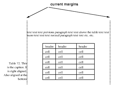
Diagram
showing a centered table with the caption extending into the left
margin, as a result of a negative margin-left property.
Like other elements of the document language, internal table elements generate rectangular boxes with content, padding, and borders. They do not have margins, however.
The visual layout of these boxes is governed by a rectangular, irregular grid of rows and columns. Each box occupies a whole number of grid cells, determined according to the following rules. These rules do not apply to HTML 4.0 or earlier HTML versions; HTML imposes its own limitations on row and column spans.
direction
property of the table.
direction property of
the table is ltr; if the direction is rtl, interchange
"left" and "right" in the previous sentence.)
Note.
Table cells may be relatively and absolutely positioned, but
this is not recommended: positioning and floating remove a box
from the flow, affecting table alignment.
Here are two examples. The first is assumed to occur in an HTML document:
<TABLE>
<TR><TD>1 <TD rowspan="2">2 <TD>3 <TD>4
<TR><TD colspan="2">5
</TABLE>
<TABLE>
<ROW><CELL>1 <CELL rowspan="2">2 <CELL>3 <CELL>4
<ROW><CELL colspan="2">5
</TABLE>
The second table is formatted as in the figure on the right. However, the HTML tables rendering is explicitly undefined by HTML, and CSS doesnt try to define it. User agents are free to render it, e.g., as in the figure on the left.

On the left, one possible rendering of an erroneous HTML 4.0 table; on the right, the only possible formatting of a similar, non-HTML table.
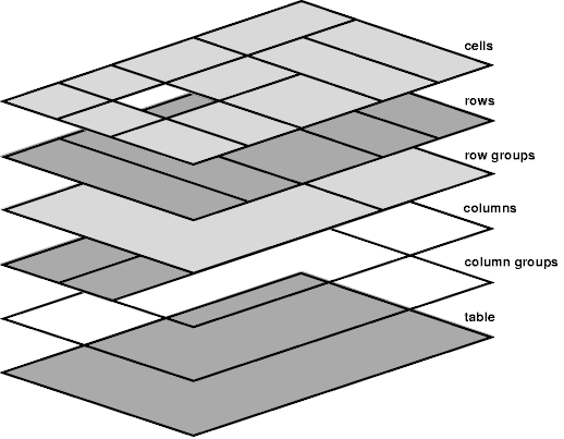
Schema of table layers.
The lowest layer is a single plane, representing the table box itself. Like all boxes, it may be transparent.
The next layer contains the column groups. The columns groups are as tall as the table, but they need not cover the whole table horizontally.
On top of the column groups are the areas representing the column boxes. Like column groups, columns are as tall as the table, but need not cover the whole table horizontally.
The next to last layer contains the rows. The rows also cover the whole table.
The topmost layer contains the cells themselves. As the figure shows, although all rows contain the same number of cells, not every cell may have specified content. These "empty" cells are transparent, letting lower layers shine through.
In the following example, the first row contains four cells, but the second row contains no cells, and thus the table background shines through, except where a cell from the first row spans into this row. The following HTML code and style rules
    <STYLE type="text/css">
      TABLE { background: yellow; border-collapse: collapse }
      TD    { background: red; border: double black }
    </STYLE>

    <TABLE>
      <TR><TD> 1 <TD rowspan=2> 2 <TD> 3 <TD> 4 </TR>
      <TR><TD></TD></TR>
    </TABLE>
|
|

Table with three empty cells in the bottom row.
table-layout propertytable-layout property controls the algorithm used to lay out the table cells, rows, and columns.
table-layout:
auto | fixed | inheritauto;
Applies to: table and inline-table elements; NOT Inherited;
Media: visual
The tables width may be specified explicitly with the
width property,
auto (for both display: table and display: inline-table) means use the automatic table layout algorithm.
In the fixed table layout algorithm, the width of each column is determined as follows:
auto for the
width property sets the width
for that column.
auto
for the width property sets the
width for that column. If the cell spans more than one column, the
width is divided over the columns.
The width of the table is then the greater of the
value of the width property
for the table element and the sum of the column widths (plus
cell spacing or borders). If the table is wider than the columns,
the extra space should be distributed over the columns.
The user agent can begin to lay out the table once
the entire first row has been received. Cells in subsequent rows do
not affect column widths. Any cell that has content that overflows
uses the overflow property to
determine whether to clip the overflow content.
table‑layout is auto; they
can use any other algorithm.
Column widths are determined as follows:
width (W) of the cell
is greater than MCW, W is the minimum cell width. A value
of auto means that MCW is the minimum cell width.
Also, calculate the "maximum" cell width of each cell: formatting then content without breaking lines other than where explicit line breaks occur.
width, whichever is larger). The
maximum is that required by the cell with the largest maximum cell
width (or the column width,
whichever is larger).
This gives a maximum and minimum width for each column. Column widths influence the final table width as follows:
table or inline-table elements width property has a specified value (W)
other than auto, the propertys computed value is the greater of W
and the minimum width required by all the columns plus cell
spacing or borders (MIN). If W is greater than MIN, the extra width should be
distributed over the columns.
table or inline-table element has width: auto, the
computed table width is the greater of the tables containing block
width and MIN. However, if the maximum width required by the columns
plus cell spacing or borders (MAX)
is less than that of the containing block, use MAX.
A percentage value for a column width is relative to the table
width. If the table has width: auto, a percentage represents a
constraint on the columns width, which a UA should try to
satisfy. (Obviously, this is not always possible: if the columns
width is 110%, the constraint cannot be satisfied.)
Note. In this algorithm, rows (and row
groups) and columns (and column groups) both constrain and are
constrained by the dimensions of the cells they contain. Setting the
width of a column may indirectly influence the height of a row, and
vice versa.
height property for the table or
inline-table element. A value of auto means that the height is the
sum of the row heights plus any cell spacing or borders. Any other
value specifies the height explicitly; the table may thus be taller or
shorter than the height of its rows. CSS2 does not specify rendering
when the specified table height differs from the content height, in
particular whether content height should override specified height; if
it doesnt, how extra space should be distributed among rows that add
up to less than the specified table height; or, if the content height
exceeds the specified table height, whether the UA should provide a
scrolling mechanism. Note. Future versions of CSS
may specify this further.
The height of a table‑row elements box is calculated once the
user agent has all the cells in the row available: it is the maximum
of the rows specified height
and the minimum height (MIN) required by the cells. A height value of auto for a
table‑row means the computed row height is MIN. MIN depends on cell
box heights and cell box alignment (much like the calculation of a line box height). CSS2 does not
define what percentage values of height refer to when specified for
table rows and row groups.
In CSS2, the height of a cell box is the maximum of the table
cells height property and the
minimum height required by the content (MIN). A value of auto for
height implies a computed value
of MIN. CSS2 does not define what percentage values of height refer to when specified for
table cells.
CSS2 does not specify how cells that span more than row affect row height calculations except that the sum of the row heights involved must be great enough to encompass the cell spanning the rows.
The vertical-align
property of each table cell determines its alignment within the row.
Each cells content has a baseline, a top, a middle, and a bottom, as
does the row itself. In the context of tables, values for vertical-align have the
following meanings:
baselinetopbottommiddlesub, super, text-top, text-bottomThe baseline of a cell is the baseline of the first line box in the cell. If there is no text, the baseline is the baseline of whatever object is displayed in the cell, or, if it has none, the bottom of the cell box. The maximum distance between the top of the cell box and the baseline over all cells that have vertical-align: baseline is used to set the baseline of the row. Here is an example:
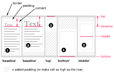
Diagram showing the effect of
various values of vertical-align on table cells.
Cell boxes 1 and 2 are aligned at their baselines. Cell box 2 has the largest height above the baseline, so that determines the baseline of the row. Note that if there is no cell box aligned at its baseline, the row will not have (nor need) a baseline.
To avoid ambiguous situations, the alignment of cells proceeds in the following order:
vertical-align: top are positioned.
Cell boxes that are smaller than the height of the row receive extra top or bottom padding.
text-align property.
When the text-align
property for more than one cell in a column is set to a <string> value, the
content of those cells is aligned along a vertical axis. The beginning
of the string touches this axis. Character directionality determines
whether the string lies to the left or right of the axis.
Only useful if the text fits on one line.
text-align
is a string but the string doesn't occur in the cell, the end of the content touches the vertical axis of alignment.
Alignmet strings do not have to be the same for each cell.
CSS does not provide a way specify the offset of the vertical alignment axis with respect to the edge of a column box.
The following style sheet should cause the column of dollar figures in the table to align along the decimal point. The :before pseudo-element to insert a dollar sign before each figure.
   TD { text-align:'.' }
   TD:before { content: "$" }
<TABLE border=1> <COL width="200"> <TR> <TH>Long distance calls <TR> <TD> 1.30 <TR> <TD> 2.50 <TR> <TD> 10.80 <TR> <TD> 111.01 <TR> <TD> 85. <TR> <TD> 90 <TR> <TD> .05 <TR> <TD> .06 </TABLE> |
generated via code shown
|
generated using <PRE> and EXPLICIT $
|
visibility:collapse †
for row, row group, column, and column group elements,
17.6 Borderssee section 8 Box
Distinct models for setting borders:
border-collapse:
collapse | separate | inherit
Initial:collapse; Applies to: table and inline-table elements;
Inherited;
Media:visual
Many border styles can be achieved with either model, so it is often a matter of taste which one is used. | |||||||||||||||||||||||||||||||||||||||||||||||||||||||||||||||||||||||||||||||||
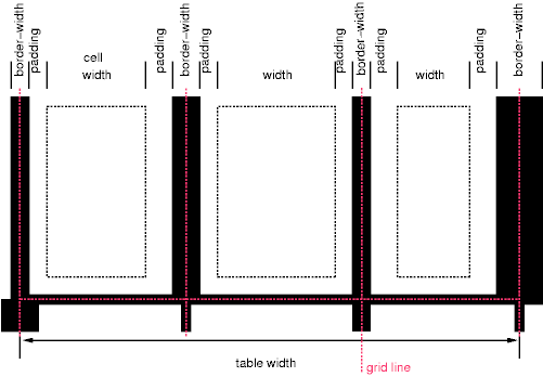
17.6.2 The collapsing border modelborder-collapse:collapseIn the collapsing border model, it is possible to specify borders that surround all or part of a cell, row, row group, column, and column group. Borders for HTMLs "rule" attribute can be specified this way. Borders are centered on the grid lines between the cells. The width of the table, the widths of the borders, the padding, and the cell width interact.
n is the number of cells in the row, and border-widthi refers to the border
between cells i and i + 1.
Schema showing the widths of cells and borders and the padding of cells. in collapsing border, the width of the table includes half the table border and Border conflict resolutionIn the collapsing border model, borders at every edge of every cell may be specified by border properties on a variety of elements that meet at that edge (cells, rows, row groups, columns, column groups, and the table itself), and these borders may vary in width, style, and color. The rule of thumb is that at each edge the most "eye catching" border style is chosen, except that any occurrence of the style hidden unconditionally turns the border off.The following rules determine which border style "wins" in case of a conflict:
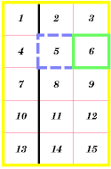
The following example illustrates the application of these precedence rules. This style sheet:
  TABLE          { border-collapse: collapse;
                   border: 5px solid yellow; }
  *#col1         { border: 3px solid black; }
  TD             { border: 1px solid red; padding: 1em; }
  TD.solid-blue  { border: 5px dashed blue; }
  TD.solid-green { border: 5px solid green; }
with this HTML source:
An example of a table with collapsed borders. The next example shows a table with horizontal rules between the
rows. The top border of the table is set to
TABLE[rules=rows] TR { border-top: solid }
TABLE[rules=rows]    { border-collapse: collapse;
                       border-top: hidden }
Table with horizontal rules between the rows. In this case the same effect can also be achieved without setting a hidden border on TABLE, by addressing the first row separately. Which method is preferred is a matter of taste.
TR:first-child { border-top: none }
TR { border-top: solid }
Here is another example of hidden collapsing borders:
Table with two omitted internal borders. HTML source:
<TABLE style="border-collapse: collapse; border: solid;">
<TR><TD style="border-right: hidden; border-bottom: hidden">foo</TD>
    <TD style="border: solid">bar</TD></TR>
<TR><TD style="border: none">foo</TD>
    <TD style="border: solid">bar</TD></TR>
</TABLE>
| |||||||||||||||||||||||||||||||||||||||||||||||||||||||||||||||||||||||||||||||||
17.6.1 The separated borders modelborder-collapse:separate
border-spacing:
<length>
<vlength>?
|
inheritInitial: 0 Applies to: table and inline-table elements Inherited;
Media:visual
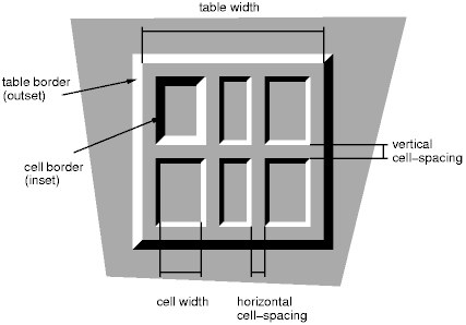
distance that separates adjacent cell borders. In this model, each cell has an individual border. The
  TABLE.bo      { border: outset 10pt; border-collapse: separate; border-spacing: 15pt ;border-color:blue}
  TD.bo         { border: inset 5pt }
  TD.bospecial { border: inset 10pt ; border-color:pink}  /* The top-left cell */

<table class=bo>
<tr><td class=bospecial> 1,1 <td class=bo> 1,2 <td class=bo> 1,3
<tr><td class=bo>        2,1 <td class=bo> 2,2 <td class=bo> 2,3
</table>
A table with border-spacing set to a length value. Borders around empty cells: the empty-cells propertyempty-cells: show | hide | inheritApplies to:table‑cell elements; Inherited; Media:visual In the separated borders model, this property controls the
rendering of borders around cells that have no visible content. Empty
cells and cells with the visibility property set to
|
border-style have
different meanings in tables than for other elements. In the list
below they are marked with an asterisk.
none
| No border. |
*hidden
| Same as none, but in the collapsing
border model, also inhibits any other border
(see border conflicts).
|
dotted
| dots |
dashed
| short lines |
solid
| single line |
double
| two solid lines. The sum of the width of the lines and the
space between is the value of border-width.
|
groove
| looks as though it were carved into the canvas. |
ridge
| looks as though it were coming out of the canvas. |
*inset
| In the separated borders model,
the border makes the entire box look as though
it were embedded in the canvas. In the collapsing border model, same as groove.
|
*outset
| In the separated borders model,
the border makes the entire box look as though
it were coming out of the canvas. In the collapsing border model, same as ridge.
|
When a table is spoken by a speech generator, the relation between the data cells and the header cells must be expressed in a different way than by horizontal and vertical alignment. Some speech browsers may allow a user to move around in the 2-dimensional space, thus giving them the opportunity to map out the spatially represented relations. When that is not possible, the style sheet must specify at which points the headers are spoken.
speak-header property| Value: | once | always | inherit Initial:once; Applies to:elements that have table header information Inherited; Media:aural |
This property specifies whether table headers are spoken before every cell, or only before a cell when that cell is associated with a different header than the previous cell. Values have the following meanings:
once
always
Each document language may have different mechanisms that allow authors to specify headers. For example, in HTML 4.0 ([HTML40]), it is possible to specify header information with three different attributes ("headers", "scope", and "axis"), and the specification gives an algorithm for determining header information when these attributes have not been specified.
 >
>
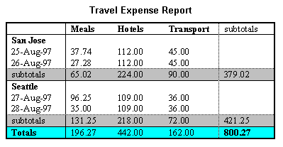
Image of a table with header cells ("San Jose" and "Seattle") that are not in the same column or row as the data they apply to.
This HTML example presents the money spent on meals, hotels and transport in two locations (San Jose and Seattle) for successive days. Conceptually, you can think of the table in terms of a n-dimensional space. The headers of this space are: location, day, category and subtotal. Some cells define marks along an axis while others give money spent at points within this space. The markup for this table is:
<TABLE>
<CAPTION>Travel Expense Report</CAPTION>
| <TR> <TH> <TH> | Meals <TH>Hotels <TH>Transport <TH> | subtotal | |||||||||||||||
| <TR> <TH id="san-jose" axis="san-jose"> | San Jose
| <TR> <TH headers="san-jose"> | 25-Aug-97 <TD>37.74 <TD>112.00 <TD>45.00 <TD>
| <TR> <TH headers="san-jose"> | 26-Aug-97 <TD>27.28 <TD>112.00 <TD>45.00 <TD>
| <TR> <TH headers="san-jose"> | subtotal <TD>65.02 <TD>224.00 <TD>90.00 <TD>379.02
| <TR> <TH id="seattle" axis="seattle"> | Seattle
| <TR> <TH headers="seattle"> | 27-Aug-97 <TD>96.25 <TD>109.00 <TD>36.00 <TD>
| <TR> <TH headers="seattle"> | 28-Aug-97 <TD>35.00 <TD>109.00 <TD>36.00 <TD>
| <TR> <TH headers="seattle"> | subtotal <TD>131.25 <TD>218.00 <TD>72.00 <TD>421.25
| <TR> <TH> | Totals <TD>196.27 <TD>442.00 <TD>162.00 <TD>800.27
| |
By providing the data model in this way, authors make it possible for speech enabled-browsers to explore the table in rich ways, e.g., each cell could be spoken as a list, repeating the applicable headers before each data cell:
  San Jose, 25-Aug-97, Meals:  37.74
  San Jose, 25-Aug-97, Hotels:  112.00
  San Jose, 25-Aug-97, Transport:  45.00
 ...
The browser could also speak the headers only when they change:
San Jose, 25-Aug-97, Meals: 37.74 Hotels: 112.00 Transport: 45.00
  26-Aug-97, Meals: 27.28 Hotels: 112.00
...